



What Makes a Watch Look Expensive, Even If It Isn't
You have seen it happen at a wedding or a business meeting. Two men, both wearing steel watches that probably cost about the same amount, and yet one wrist looks like old money while the other looks like it came off a market stall in Computer Village. Here is the truth that most people never figure out: a watch that looks expensive is rarely about the brand name stamped on the dial. It is about a handful of specific, learnable details in finishing, proportion and material choice that your eye picks up on before your brain even knows why.
This matters more in Nigeria than almost anywhere else, because a watch is one of the few accessories a man can wear to a wedding, a board meeting or a first date without saying a word about his taste. Get the details right and people assume you spent more than you did. Get them wrong, and no amount of gold plating will save you. Let's break down exactly what separates a watch that reads as premium from one that reads as plastic, so you can shop smarter whether your budget is fifteen thousand naira or one and a half million.
Why Dial Finishing Is the First Thing People's Eyes Notice
The dial finishing is the single biggest giveaway of quality because your eye reads texture and depth before it reads any logo, and a flat, printed dial simply cannot compete with one that has dimension and movement under light. Cheap watches almost always use a flat, matte or glossy printed surface because it is the least expensive way to put numbers on a disc of metal. Watches that look expensive use finishing techniques that change appearance depending on the angle you view them from.
The finish to look for is called a sunburst dial (sometimes called a soleil finish). It is created with ultra-fine radial brushing that spreads outward from the center of the dial like rays of light. Tilt your wrist under a lamp and the dial appears to shimmer and rotate, shifting from a bright highlight to a shadowed low. This single detail can make a modestly priced watch look like it belongs in a much higher price bracket, because it signals that someone bothered to machine the dial rather than just print a pattern on it.
Other finishing details that separate premium from cheap include:
- Applied indices instead of printed ones. Applied indices are separate metal markers physically attached to the dial so they sit in relief and catch the light. Printed indices are flat paint or ink directly on the surface. Applied markers require an extra manufacturing step, and your eye can tell the difference in under a second, even from across a room.
- Beveled, polished edges on the case and lugs, rather than a single rough brushed surface all the way around.
- A textured dial such as a fine grain, guilloche pattern or linen texture, rather than a completely flat, glossy surface with nothing going on.
- Contrasting finishes on the same case, for example a brushed top with polished bevels along the sides, which is how far more expensive watches are typically finished.
How Case Size and Proportion Decide Whether a Watch Reads as Refined or Bulky
A watch looks expensive when its proportions are balanced for the wrist wearing it, not simply when the case is large, and the most reliable measurement for this is not diameter at all but lug to lug length. Many Nigerian buyers assume bigger automatically means more impressive. It is actually the opposite that tends to read as premium.
Here is what actually matters:
- Lug to lug distance should sit at roughly 75 to 95 percent of your wrist's width. If the lugs, the horns that hold the strap, extend past the edge of your wrist, the watch will look oversized even if the case diameter itself seems reasonable.
- Case diameter works best at around 60 to 75 percent of your flat wrist width. For most average adult wrists that lands somewhere between 38mm and 42mm, though slimmer wrists look more polished in 34mm to 38mm.
- Thinness matters more than people expect. A slim case with a diameter to thickness ratio close to 3 to 1 wears with an elegance that a thick, chunky case simply cannot match, no matter how shiny the metal is. A watch that towers off the wrist reads as costume jewelry, not luxury.
The real problem with oversized watches is that they overcompensate. A watch that sits correctly and disappears into your cuff until you check the time looks deliberate and confident. A watch that dominates your wrist and catches on every sleeve looks like it is trying too hard, which is the opposite of what expensive taste actually communicates.
What Materials Actually Signal Quality Up Close
Materials tell on a watch the moment someone gets within arm's reach, and the two details that matter most are the metal used for the case and bracelet and the crystal covering the dial, because these are the surfaces people touch and study directly. You do not need solid gold or platinum to look expensive. You need materials that resist the small, cheap looking failures that give away a low quality piece within a year of wear.
- Surgical-grade or 316L stainless steel takes a polish well, resists corrosion in Nigeria's humidity, and does not develop that dull, pitted look that cheaper alloys get within months.
- Sapphire crystal, or at minimum a hardened mineral crystal, stays scratch-free far longer than plain glass or plastic acrylic, which fogs and scratches quickly and instantly signals a bargain purchase.
- Muted metal tones. Bright, brassy yellow gold plating or an overly orange rose gold reads as costume jewelry. Premium looking finishes use softer, more muted tones such as champagne gold or a restrained rose gold, and they favor brushed or matte surfaces over a mirror-bright shine that can look plasticky under fluorescent light.
- Weight in the hand. A watch that feels hollow or unusually light for its size tips people off immediately. A slightly denser, more substantial feel (without tipping into bulky, as covered above) reads as quality construction.
The Strap or Bracelet Upgrade Almost Nobody Talks About
Swapping the strap is the fastest, cheapest way to transform how expensive a watch looks, and it works because the strap touches your skin and your cuff constantly, making it the detail people notice almost as often as the dial itself. A tired rubber strap or a stretched, shiny leather band undoes even a genuinely well finished case.
- A quality leather strap with clean, even stitching and a proper buckle or butterfly clasp instantly upgrades a watch's presence, and a good aftermarket strap costs a fraction of the watch itself.
- Matching the strap's hardware finish to the case (steel buckle with a steel case, for example) keeps the whole look coherent rather than mismatched.
- Metal bracelets should sit flush against the wrist with no visible gaps, and links that are solid rather than hollow feel and sound noticeably more substantial when you shake your wrist.
- If a bracelet already feels loose or rattly out of the box, that alone is often the tell that separates a watch that looks expensive from one that does not, regardless of what the dial looks like.
Quick Reference: Comparing What Reads as Expensive vs What Reads as Cheap
| Detail | Reads as Expensive | Reads as Cheap |
|---|---|---|
| Dial finish | Sunburst, guilloche or textured, changes under light | Flat, glossy or matte print, looks the same from every angle |
| Indices | Applied metal markers with visible depth | Flat printed numbers or dots |
| Case size | Lug to lug fits within the wrist, diameter proportioned to wrist size | Oversized case that overhangs the wrist |
| Case thickness | Slim, close to a 3 to 1 diameter to thickness ratio | Thick, chunky profile |
| Case finishing | Mixed brushed and polished surfaces with clean bevels | One uniform finish, often overly shiny |
| Crystal | Sapphire or hardened mineral, resists scratches | Plain acrylic, scratches and fogs quickly |
| Metal tone | Muted champagne gold, soft rose gold, brushed steel | Bright brassy yellow gold, harsh mirror shine |
| Strap or bracelet | Well stitched leather or solid metal links, sits flush | Stretched leather, hollow rattly links |
How to Style a Watch So It Looks Even More Expensive Than It Is
Styling can push an already well made watch further, and the fastest wins are matching your metals, keeping your strap fresh, and choosing simplicity over clutter so the watch reads as an intentional choice rather than an afterthought. To fix a look that feels flat, start with the basics.
- Match your metals. If your watch case is steel, keep your belt buckle, cufflinks and other jewelry in silver tones rather than mixing in warm gold accents that fight with it.
- Keep the crystal and case clean. Wipe fingerprints and dust off before you leave the house. A smudged crystal kills the sunburst effect and dulls even the best finishing.
- Choose one statement piece. Wearing a bold watch alongside heavy bracelets or a busy chain competes for attention and cheapens the overall look. Let the watch be the focal point.
- Roll or fit your cuff so the watch shows. A watch buried under a loose sleeve loses all its visual impact, no matter how well finished it is.
- Service and clean it regularly. A watch with a scratched crystal, a stretched bracelet or a grimy case band will never look expensive again until those issues are fixed, so build basic care into your routine.
If you are shopping with these details in mind, browse our watch collection here and look specifically for sunburst dials, applied indices and proportioned case sizes rather than shopping on brand name alone. Our collection is chosen with exactly these finishing details in mind, so you are not left guessing which details actually hold up.
Caring for the Details That Keep a Watch Looking Premium
A watch only looks expensive for as long as its finishing stays intact, which means the sunburst dial, the polished bevels and the crystal all need basic, consistent protection from scratches, moisture and grime. A few simple habits go a long way:
- Wipe the case and crystal with a soft, dry microfiber cloth after wearing it, especially in Nigeria's dust and humidity.
- Avoid resting your watch face down on hard surfaces, which is the most common cause of crystal scratches.
- Keep it away from perfume and alcohol-based sprays, which can dull a leather strap and, over time, cloud certain finishes.
- Have the bracelet or strap checked periodically. A sagging bracelet or a cracking strap will undercut even the sharpest dial.
- Store it away from direct sunlight when not in use, since prolonged UV exposure can fade certain dial colors and strap materials over time.
Ready to put these details to work. Shop watches built with these finishing details here and compare the dial texture, case proportions and strap quality for yourself before you decide.
Frequently Asked Questions
Can a watch under 50,000 naira actually look expensive?
Yes, if it gets the fundamentals right. Look for a sunburst or textured dial, applied rather than printed indices, a proportioned case that does not overhang your wrist, and a sapphire or hardened mineral crystal. These details cost the manufacturer relatively little extra but make the biggest visual difference, far more than brand recognition alone.
Does a bigger watch face automatically look more expensive?
No, and this is one of the most common mistakes buyers make. An oversized case that overhangs your wrist reads as costume jewelry rather than refined taste. A watch that looks expensive fits your wrist proportionally, with the lug to lug distance sitting within about 75 to 95 percent of your wrist's width, and often a slimmer profile looks more premium than a thick one.
What is the fastest way to upgrade how an existing watch looks?
Change the strap. A fresh, well stitched leather strap or a solid, properly fitted metal bracelet transforms the overall impression of a watch almost instantly, since the strap touches your skin and cuff constantly and is one of the first details people notice up close.
Why do some gold-toned watches look cheap while others look luxurious?
The tone and finish of the plating make the difference. Bright, brassy yellow gold with a high mirror shine tends to look artificial and inexpensive, while a more muted champagne gold or soft rose gold, especially with a brushed or matte finish, reads as considerably more refined and expensive.
Featured in our collection
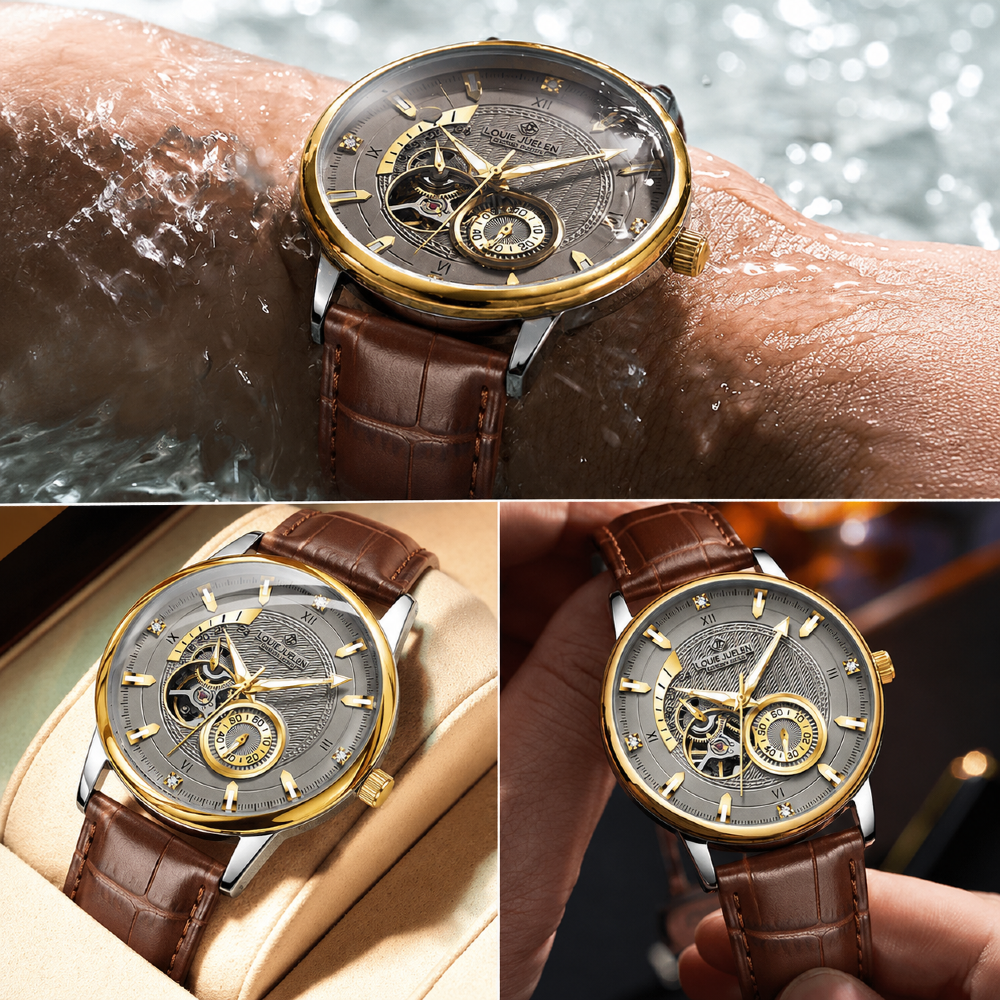
Louis Juelen Luxury Automatic(Tourbillion ) Premium Watch
Automatic Watch Winder
₦85,000
₦150,000
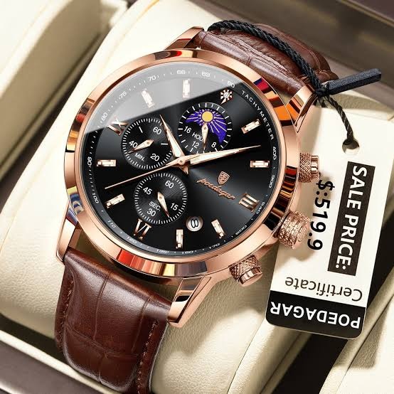
Poedagar Chronograph Luxury Watch
Free 24ml luxury Roll On oil perfume
₦45,000
₦65,000

Louis Juelen Automatic Chain Strap
Automatic Watch Winder
₦140,000
₦250,000
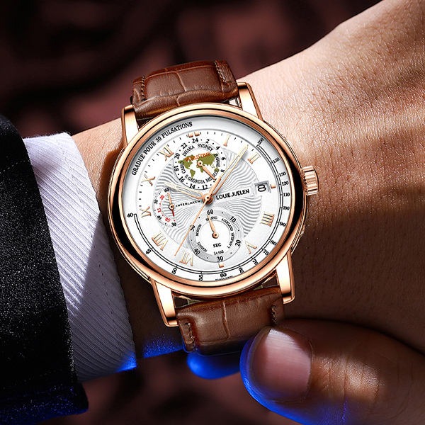
Louis Juelen Luxury Chronograph Leather Watch
Free 24ml luxury Roll On oil perfume
₦55,000
₦85,000